Flyer Design
Social Media Post
Food Photography
Client: Chez Ad Traiteur

Overview
The client is a catering business called Chez Ad. They were making their first pop-up and wanted an elevated visual identity that can put emphasis on the fine dining quality and the exclusive Caribbean dishes they offered.
The challenge was to create a visual identity that felt cohesive from their Instagram presence to their physical promotional materials while being mindful of printing costs, specifically, a limited color palette, no full bleed printing. The identity also needed to feel distinct from typical Caribbean food branding.
vvvvvvvv
Computer Sketches

Rationale
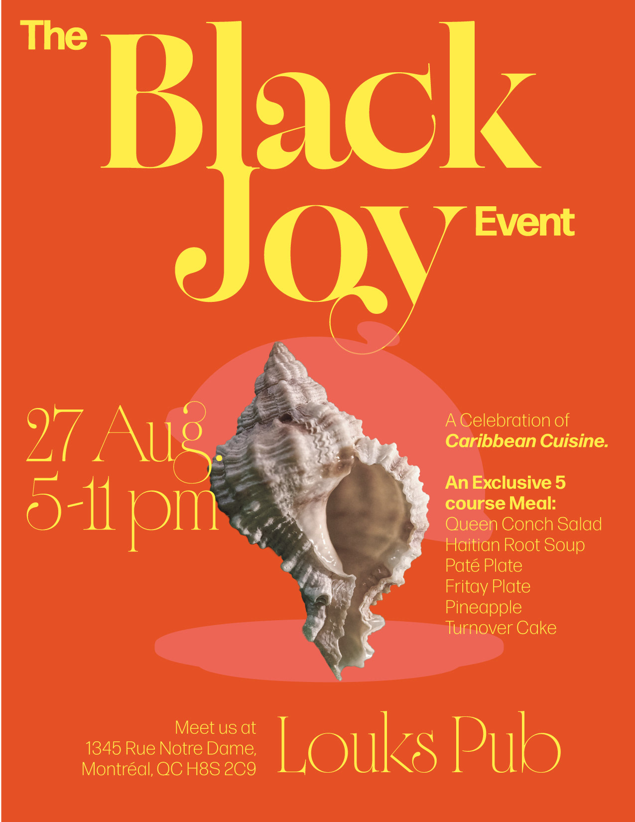
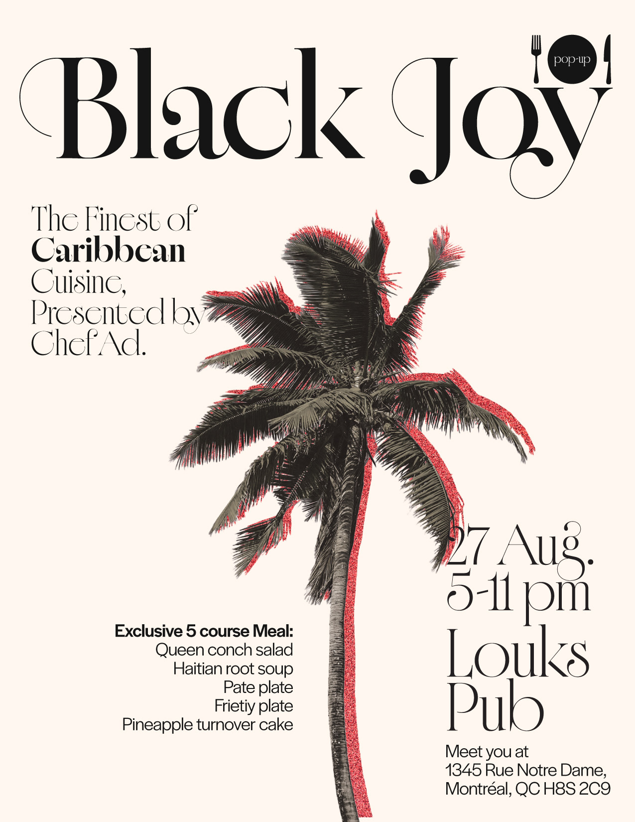
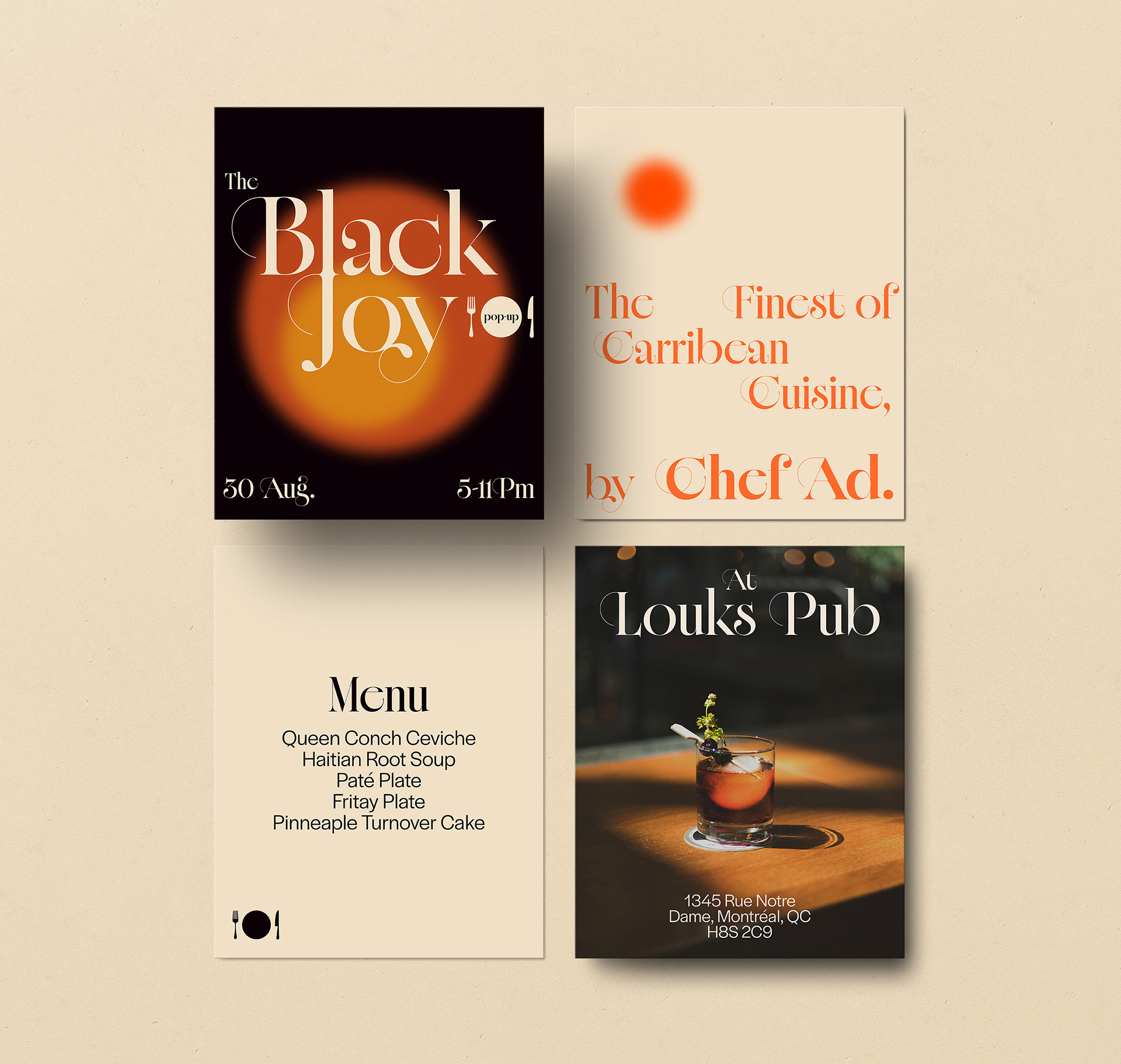
I moved away from the typical maximalist approach to Caribbean food branding while keeping the tropical identity. The contrast between the tropical imagery (the sun, the red coconut tree), while subverting expectations with a restraint approach on colors, layout and photography which creates an interesting tension that makes the brand memorable and positions the event as premium.
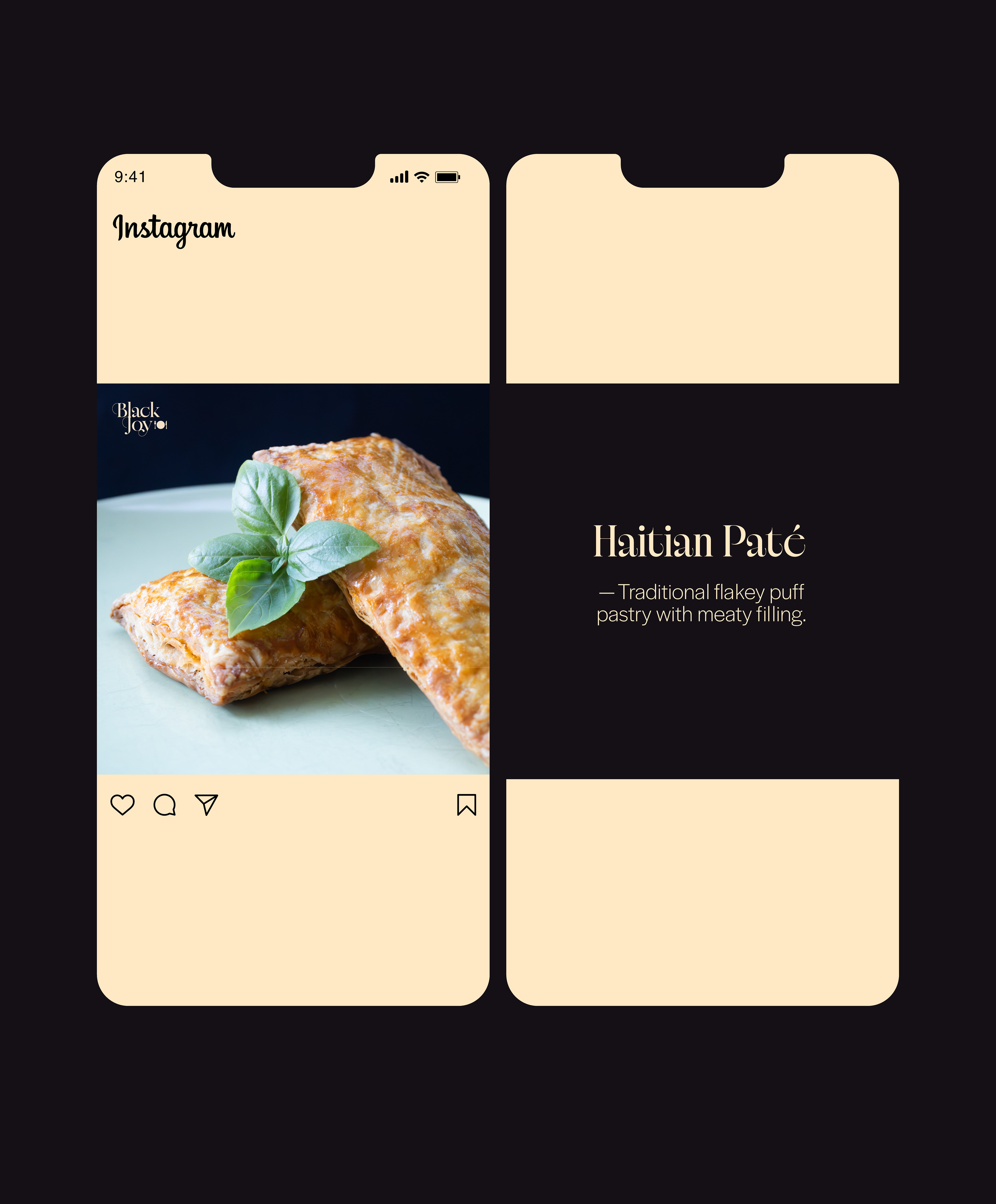
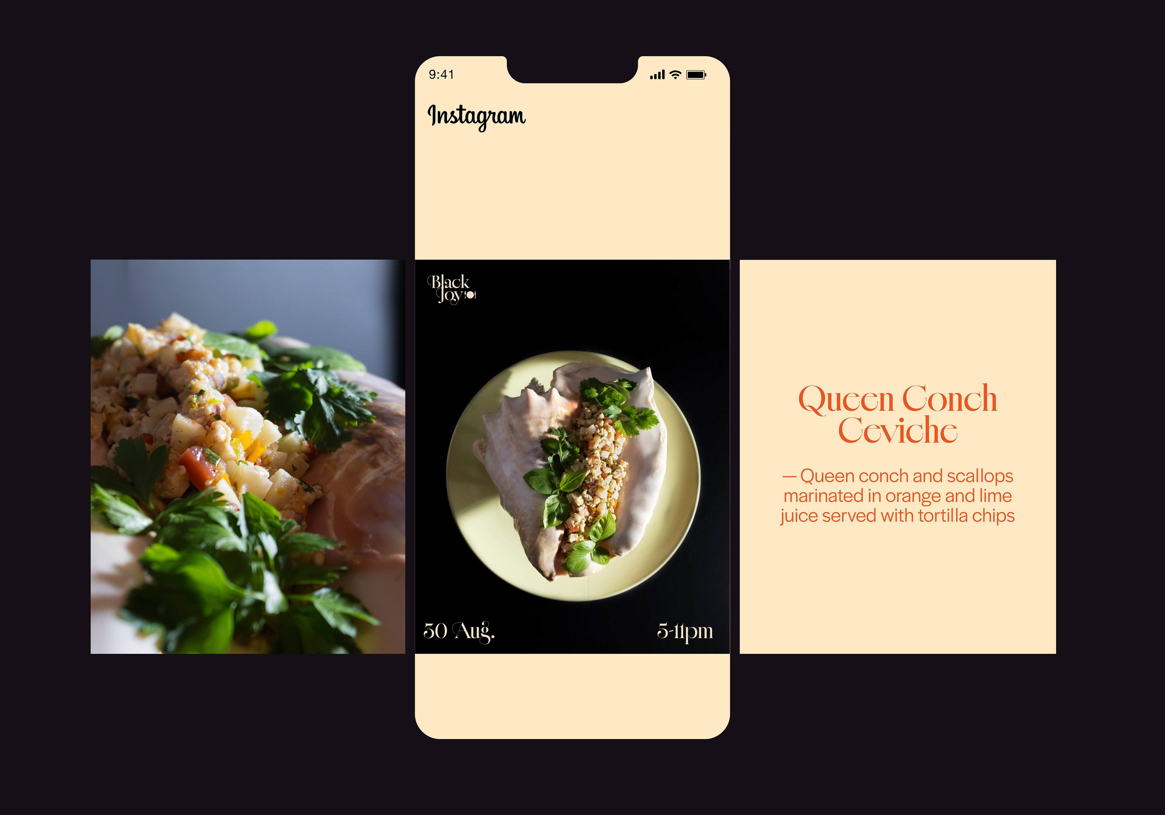
The result is a flyer and several instagram posts that follow the same visual identity. The imagery is anchored in orange gradients evocative of the heat of Caribbean sun, paired with a desaturated black and beige color. The high contrast type: Cofo Rafinné offers an elegant precision to honor the mastery required for gourmet cooking. The photos are minimalist and put emphasis on the texture of the food to reinforce the refinement of the dishes .